top of page
CLOSE TO FINALIZING


AFTER


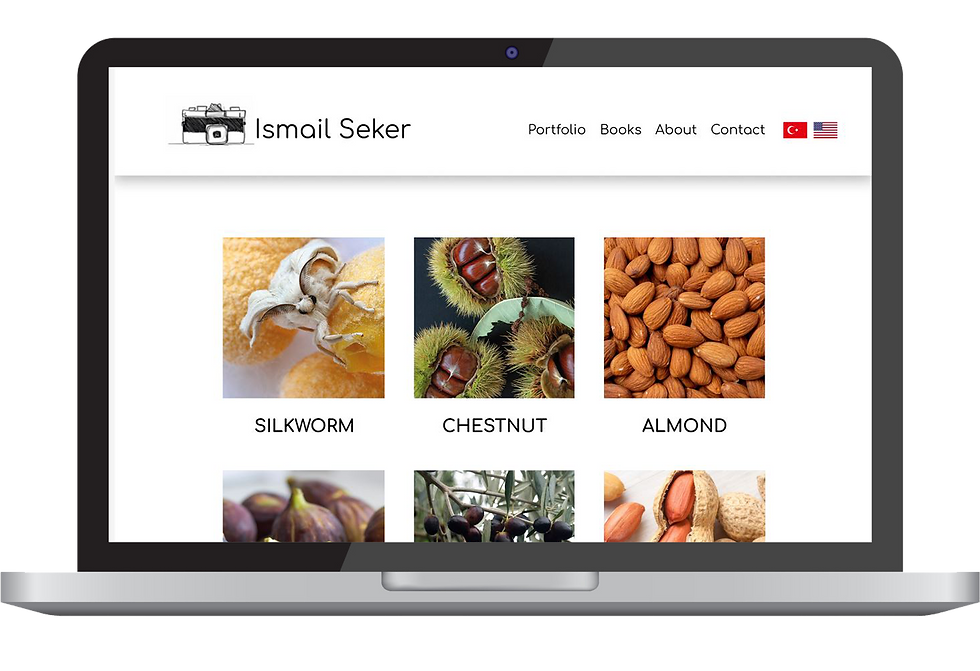
LAPTOP
MOBILE
TABLET
strip highlighting the title
The first prototype of the pages didn't have layers that created the perception of depth. There was no sense of where the elements began and ended.
BEFORE
The strip added to the beginning of the page introduces visitors to the page's theme and purpose. It not only reinforces the brand but also creates a visually engaging entry point for visitors.
There was a need to enhance the brand identity and reinforce the overall visual hierarchy on the page.
Search engines prioritize mobile-friendly websites in their rankings, so having a responsive design can positively impact the portfolio's visibility in search results. This is critical for reaching a broader audience and increasing the overall exposure of the photographer's work.
The strip added to the beginning of the page introduces visitors to the page's theme and purpose. It not only reinforces the brand but also creates a visually engaging entry point for visitors.
There was a need to enhance the brand identity and reinforce the overall visual hierarchy on the page.
The website originally catered to a Turkish audience, but to enhance accessibility and broaden its reach, an English version has been seamlessly integrated. This bilingual approach ensures a more inclusive experience, allowing users from diverse linguistic backgrounds to engage with the content and navigate the site effectively.
THE ONGOING PROJECT
The photographer is currently curating and collecting his best works to feature on the website, adding an extra layer of thoughtful consideration to the design process. Regular communication between me and the client facilitates adjustments to the design as new works are added, resulting in a cohesive and visually compelling website that effectively highlights the photographer's evolving portfolio.

ACCESSIBILITY
TARGET & challenge
The primary target is to visually impress visitors and effectively communicate the photographer's style and skills. Balancing aesthetics with functionality, ensuring optimal loading speed for image-heavy content, and creating a user-friendly interface that facilitates easy navigation through the portfolio.

This website showcases a curated collection of his best works, providing a visually engaging platform for potential clients or admirers to explore his artistic style, books, skills, and diverse projects.
HIGH-FIDELITY PROTOTYPE
The first high-fidelity wireframe for the website builds upon the foundational structure established in the low-fidelity version on Figma. Attention is given to typography, color schemes, and image transitions, elevating the user experience.

It introduces a refined and polished visual aesthetic, incorporating actual high-resolution images to provide a realistic representation of the final design. The desktop version of this high-fidelity wireframe represents a harmonious blend of functionality and visual appeal, ensuring a compelling presentation of the photographer's artistry to viewers on larger screens.

The responsive design tailored for smaller screens prioritizes a mobile-friendly experience, optimizing the display of the photographer's work in a compact yet visually impactful manner. Seeing the overall flow and potential design is crucial for both me as the designer and the client to make the essential improvements later.

The initial low-fidelity wireframe focuses on fundamental layout and functionality. Simplicity is prioritized, ensuring an intuitive user experience with minimal distractions. It strategically places key elements such as the navigation menu, header, footer, and portfolio grid.
low-fidelity wireframes
I was responsible for paper and digital wireframing, UX analysis (flows), low- and high-fidelity prototyping, iterating on the UI, and search engine optimization (SEO) on Wix.
RESPONSIBILITIES
bottom of page